

How do you plan wayfinding signs for a small office or shop?
Wayfinding signs come in four kinds. Here is how to place them in a small office or shop, and where Singapore's accessibility and fire codes come in.
On this page
- Which sign suits which job
- Identification signs: name the door
- Directional signs: one at every turn
- Informational signs: directories and notices
- Regulatory signs and fire exits: where we stop
- Planning a small office or shop
- How big should the letters be?
- Contrast: dark on light, or light on dark
- Acrylic or 3D printed letters
- Where these facts come from
- Frequently asked
Will your lettering stand out from the sign?
Pick the sign colour and the letter colour, or start from an example.
Worked out from the colours as your screen shows them, so a painted or printed sign will differ a little. Check real samples under the light where the sign will hang, and watch for glare on glossy faces.
A wayfinding sign tells a visitor where they are, which way to go or what to know, so they do not have to ask. A small office or shop needs only a few, placed where people have to choose a way. Below is what each kind does, how big its letters should be, and where the rules in Singapore start.
Which sign suits which job
| Kind of sign | What it tells people | Where it goes | Do we make it? |
|---|---|---|---|
| Identification | The name of a place: a room, a toilet, a shop | On or beside the door | Yes, in acrylic or 3D printed letters |
| Directional | Which way to go, usually with an arrow | At each junction or turn | Yes, as a matching set |
| Informational | A fact: hours, a directory, a notice | At the entrance or in the lobby | Yes, as a printed acrylic panel |
| Regulatory | A rule: staff only, no entry | At the door or the line it protects | Your own house rules, yes |
| Fire exit | The way out in an emergency | Over exit doors, set by the Fire Code | Not listed; ask a supplier whose signs meet SS 563 |
Identification signs: name the door
An identification sign says where you are. It names a room, a toilet or a business, and gives no directions. The photo shows one on an office wall.
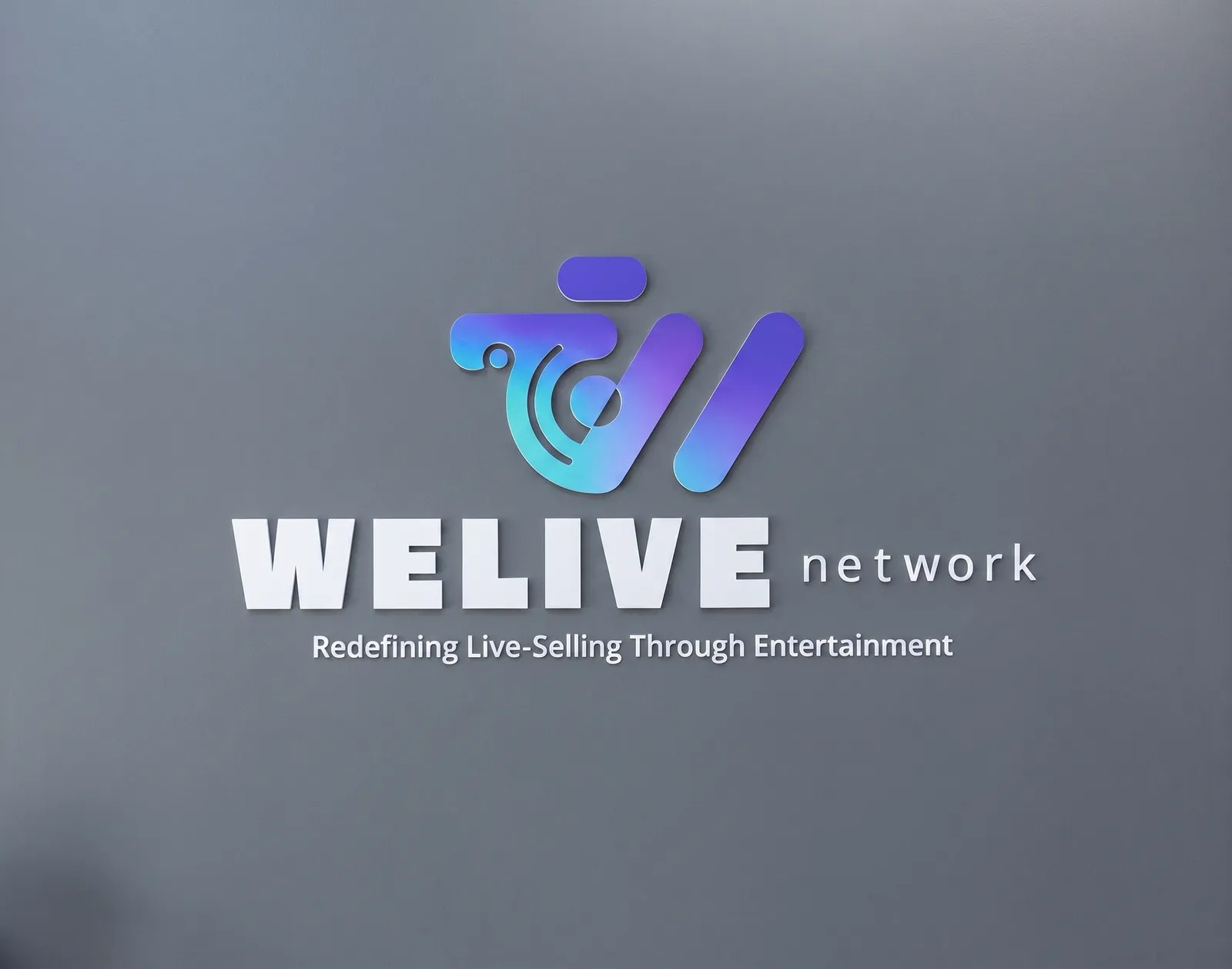
Room plates are often laser engraved instead of printed. Where Singapore’s 2025 accessibility code applies, it asks for a toilet sign on the wall next to the latch side of the door, 50 mm to 100 mm from the door jamb to the side of the sign, with its centre line 1200 mm to 1500 mm above the floor. It also asks for tactile characters or pictograms with matching Braille. Our pages do not list tactile or Braille signs, so ask us before you plan around them.
- Name each room the way staff and visitors say it.
- Keep wording and symbols the same on every door.
Directional signs: one at every turn
A directional sign keeps people moving toward a destination. It goes where they might look for directions, such as a lobby, a lift landing or a corridor split. Singapore’s 2025 accessibility code asks for directional signs carrying the Symbol of Access at main lobbies or passageways and at points where the direction changes, to direct persons with disabilities to facilities such as lifts, entrances, toilets and vehicle parks.
Keep each sign short: the code advises content that is simple and short. It also advises putting the arrow on the side it points to, left for left and right for right.
Informational signs: directories and notices
An informational sign gives a fact and no direction: opening hours, a floor directory, a note that Wi-Fi is free. It belongs where people stop, at the entrance or the lift lobby. A directory lists many places, so give it room and keep each name short.
A printed acrylic panel on stand-offs suits this, from 100 × 60 mm up to 900 × 450 mm in the sign studio. For bigger boards, ask us.
Regulatory signs and fire exits: where we stop
A regulatory sign states a rule. A house rule such as staff only is an ordinary sign, and we can make it with your wording.
A fire exit sign is different. The Singapore Civil Defence Force (SCDF) Fire Code says the entrance to every exit on every floor shall be clearly indicated by an exit sign placed over the exit door. It lists exemptions for some kinds of building and some rooms with a single door, so read the clause for yours. For electrically-powered exit and directional signs, it says the legends, dimensions, design and/or installation shall comply with SS 563. We do not list exit signs as a service. Get them from a supplier whose signs meet SS 563, and we will match our room signs to the rest of your set.
Planning a small office or shop
Plan the route, then the signs. Walk it as a first-time visitor from each entrance to each destination, and mark every point where they must choose: a corridor split, a lift, a staircase. Those points are where directional signs go.
- Mark every entrance and every door a visitor might open.
- Mark each choice point on the route between them.
- Put an identification sign on each destination.
- Put a directional sign at each choice point.
- Add a directory at the entrance.
Use one typeface, one colour scheme and one arrow style across all of it. The 2025 accessibility code advises the same: content that is simple and short, with graphical symbols and text used consistently throughout a building.
How big should the letters be?
The bigger the reading distance, the taller the letters. The current edition of Singapore’s Code on Accessibility in the Built Environment, from 2025, has no table of letter heights. It says graphical symbols must be at least 60 mm along the shorter dimension, and points to Singapore Standard SS 599, a guide for wayfinding signage in public areas, for more on design. The 2019 edition did give a table. These are the old figures, not today’s rule. Some of its rows:
| Reader stands | Lower-case letter height at least (2019 edition) |
|---|---|
| 1.5 m away | 5 mm |
| 3 m away | 10 mm |
| 6 m away | 20 mm |
| 15 m away | 50 mm |
| 25 m away | 80 mm |
| 50 m away | 160 mm |
The 2019 code measured the lower-case letters. It also scaled symbols with distance, 60 × 60 mm at least for viewing up to 7 m and 100 × 100 mm from 7 m to 18 m. The accessibility code applies to new building works and to additions and alterations to existing buildings. If your fit-out is not covered, the old table is still a handy place to start. If it is, ask the building’s designer what the project follows.
Contrast: dark on light, or light on dark
Letters must stand out from the sign, and the sign from the wall. The 2025 code says characters and symbols must be glare free, and must have colours and tones that contrast with the sign behind them and with the wall around it. It gives no percentage. The 2019 edition’s appendix called a 30 per cent difference in luminance (how much light a surface reflects) generally the least a person with partial sight can tell apart, with black and white at 100 per cent. A matt finish helps where lights shine on the sign.
The 2019 edition’s examples paired a white sign with black, dark green or dark blue lettering, and a black or dark sign with white or yellow lettering. If your brand colour is pale, put it on a dark ground.
Acrylic or 3D printed letters
Acrylic is the usual choice for flat signs (acrylic sheet explains the sheet itself). The sign studio cuts and prints 3, 5 or 10 mm sheet, with mirror options. Thick acrylic letters on stand-offs float off a wall, and flush ones sit flat.
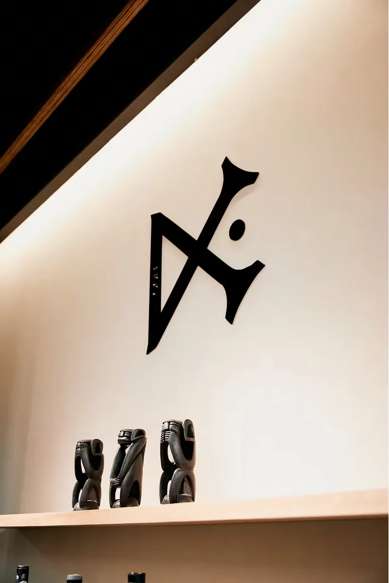
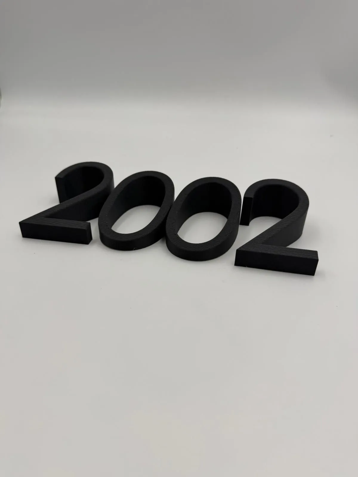
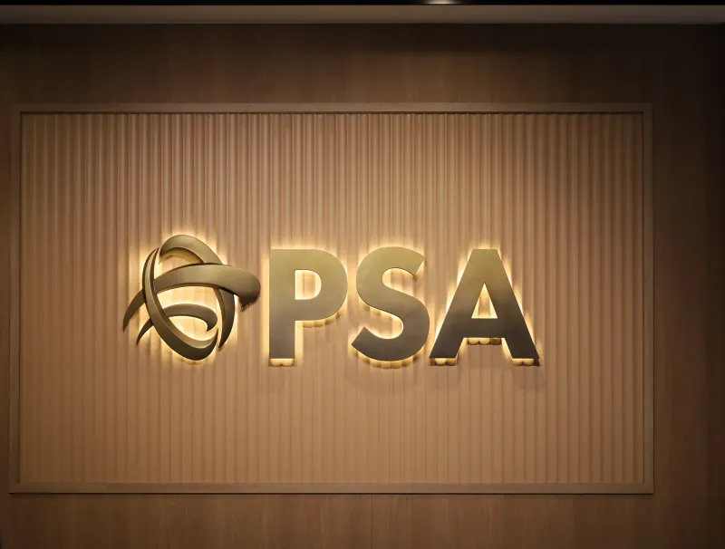
We 3D print letters when they need depth or an unusual shape, then finish them by hand. Printed digits suit door numbers, and a halo-lit set can glow behind the wall. Our PSA sign is 1.86 m across and sits on magnets, so each letter lifts off. Acrylic is happiest indoors. For outside, we suggest ASA or aluminium composite.
Where these facts come from
Every figure about Singapore’s rules was read on the official source on 19/11/2026. The codes change, so check the current edition before you rely on a number.
- Building and Construction Authority (BCA), Code on Accessibility in the Built Environment 2025, the edition BCA lists as the latest: chapter 8 (clauses 8.3 to 8.5), clause 5.8.11 and clause 1.3.5, for directional signs, glare and contrast, symbol size, advice on fonts and arrows, toilet signs and tactile reading height.
- BCA, Code on Accessibility in the Built Environment 2019, chapter 8 and Appendix D: the earlier edition’s letter-height table, symbol sizes, 30 per cent luminance figure and colour examples, used only where this post says “2019”.
- BCA, Code on Accessibility in the Built Environment: who the Code applies to, and the 2025 edition.
- SCDF, Fire Code 2023, chapter 8, clause 8.1.7: exit signs, their exemptions and SS 563.
- DuraLabel, Four Types of Wayfinding Signs: the four kinds of sign.
- 4OVER4, Wayfinding signage planning guide: walking the route and marking choice points.
- What we make is from our own pages: signage, logo signs for small businesses, 3D printed signs and letters and the PSA sign.
Frequently asked
What are the four types of wayfinding signs?
Identification, directional, informational and regulatory. Identification signs name a place, directional signs point the way, informational signs give facts such as hours or a directory, and regulatory signs state a rule. One sign can do two jobs, such as a room name with an arrow.
How tall should the letters on a sign be?
It depends on how far away the reader stands. The 2025 edition of Singapore's accessibility code, the current one, has no letter-height table. The 2019 edition did, with 10 mm for 3 metres and 20 mm for 6 metres, measured on lower-case letters. Treat those as the old figures and go larger where the space allows.
How high should I mount a sign?
For toilet signs, the 2025 accessibility code puts the centre line between 1200 mm and 1500 mm above the floor. It gives 900 mm to 1500 mm as the comfortable height for a person who reads tactile and Braille signs on a wall by touch. It also advises placing signs where people who are walking, standing or seated can see them.
Which font works best for directions?
The 2025 accessibility code advises a sans serif font with Arabic numbers. For text of more than one word it advises left alignment, a capital first letter and lower case after, which is called sentence case.
Can you make fire exit signs?
We do not list them as a service. The Fire Code says the legends, dimensions, design and/or installation of electrically-powered exit and directional signs shall comply with SS 563, a Singapore Standard. Get them from a supplier whose signs meet it. We make the room signs, directories and notices around them.
Which side does the arrow go on?
The side it points to. The 2025 accessibility code advises that arrows sit on the side of the sign they point to, so a left arrow goes on the left.
Can wayfinding signs be edge-lit acrylic?
Check it for glare first. The 2025 accessibility code says characters and symbols must be glare free, and advises that poor lighting can create glare and strong shadows that reduce legibility. If the building falls under the code, ask us about a matt, solid-colour face.
How many signs does a small shop need?
One at each point where a visitor must choose a way, plus a name on each door they might open. Walk the route as a first-time visitor and mark those points before you order anything. Signs placed between choices are easy to ignore.
Can the signs be made as a matching set?
Yes. Directories, room and door signs and washroom plates work best ordered together so every sign matches. Send the room names in one list so the typeface, colours and arrows can match across the set.
Related
-
 GuideBuying an acrylic sign: the decisions to make before you order
-
 GuideWhat kinds of backlit signage are there, and which suits you?
-
 GuideHow 3D-Printed Signage Letters Are Designed and Made
-
 ServiceCustom Signage
-
 ServiceLaser Engraving & Cutting
-
 ServiceIndustrial 3D Printing
-
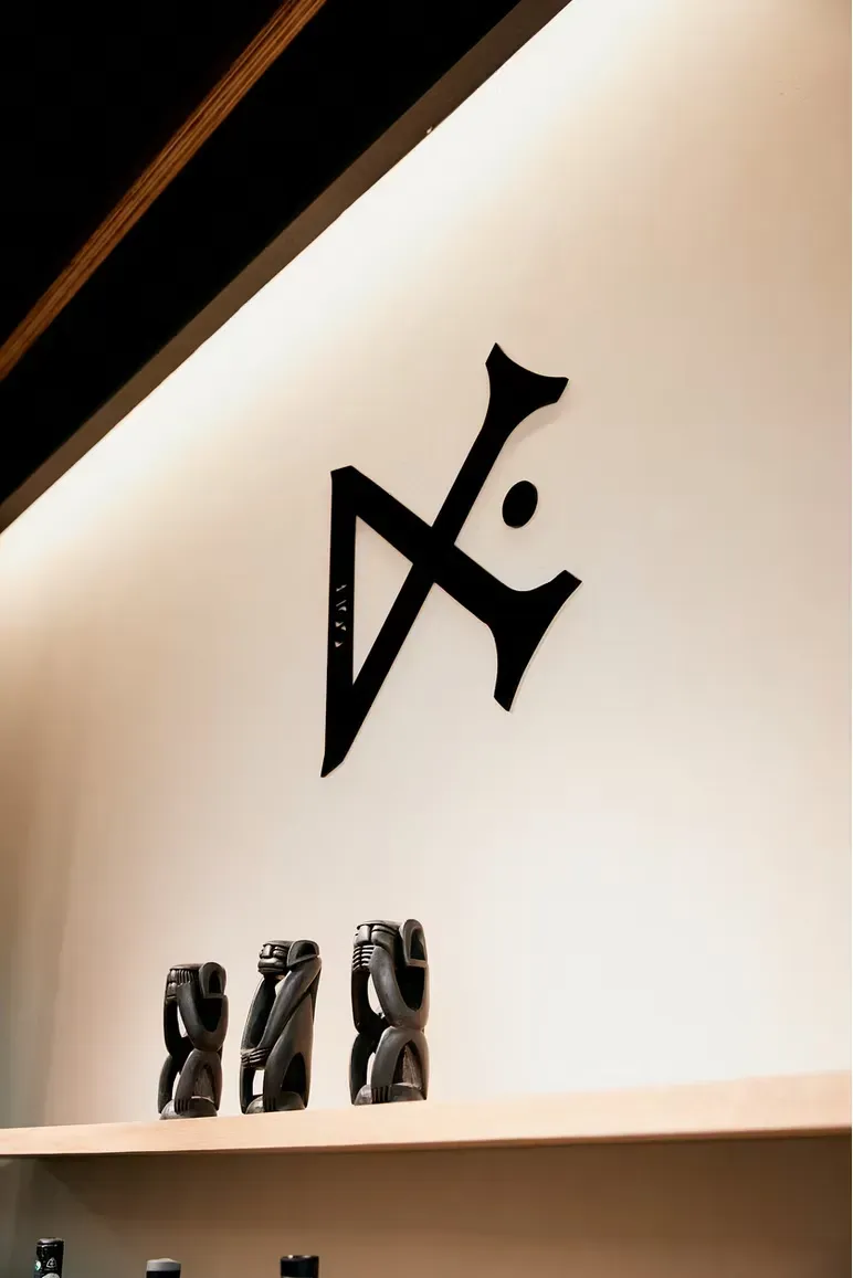 ProjectLogo signs for small businesses
-
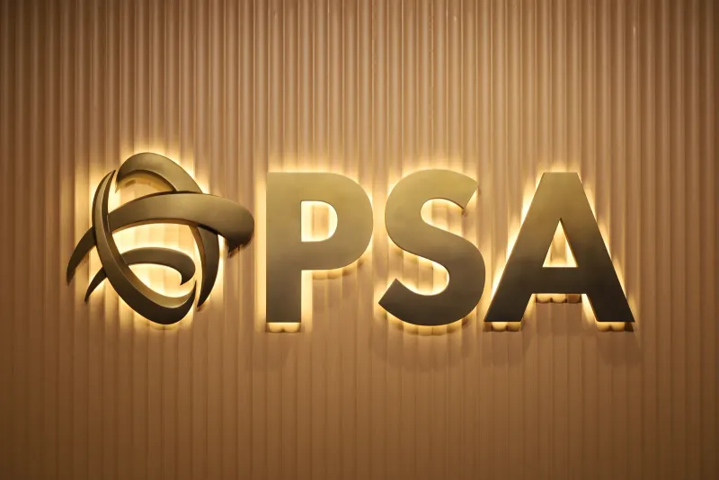 ProjectHalo-lit 3D printed logo sign for PSA
-
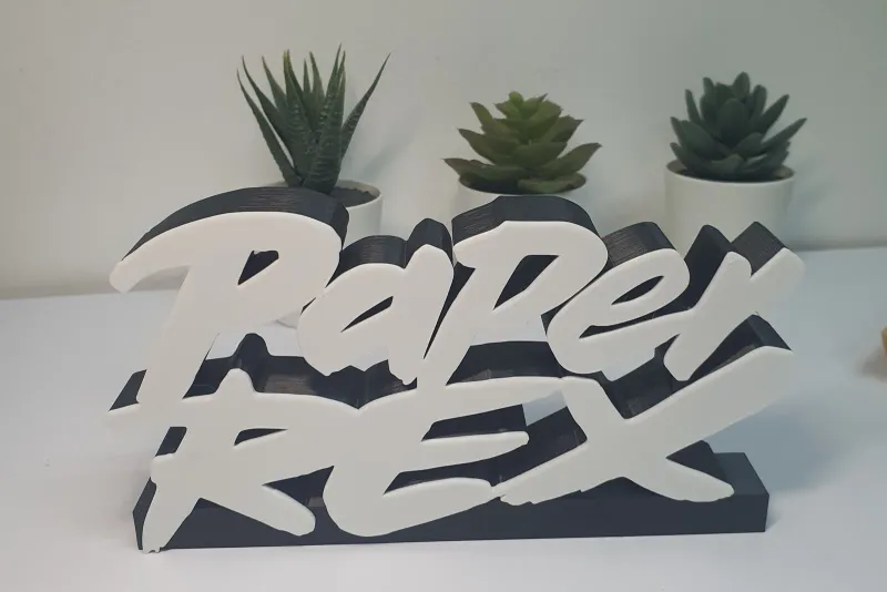 Project3D printed signs and letters